PORTFOLIO:
ODEON FILM STUDIO BRANDING 2005
ODEON FILM STUDIO BRANDING 2005
Project Background
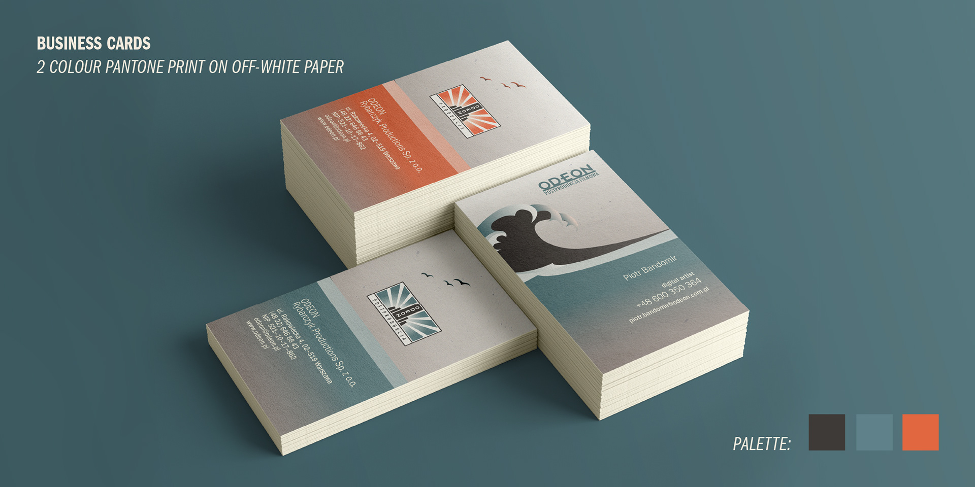
Between 2004 and 2006, shortly after graduating from the Animation Department at the National Film School in Łódź, I started my first 2D animation job at Odeon Film Studio in Warsaw. Alongside animation, I took on a larger challenge—designing the studio’s full visual identity, from logo update to printed materials like VHS and DVD packaging, greeting cards, and leaflets. All were printed on off-white, vintage-style paper using a limited three-Pantone palette to evoke a refined, cinematic, retro feel.
Concept and Collaboration
The concept was developed in a collaboration with studio owner Leszek Rybarczyk, a pioneer of advertising and computer FX in Warsaw. Together, we shaped an idea of the "Steamboat Odeon", which fused cinematic storytelling with a sense of luxury and nostalgia.
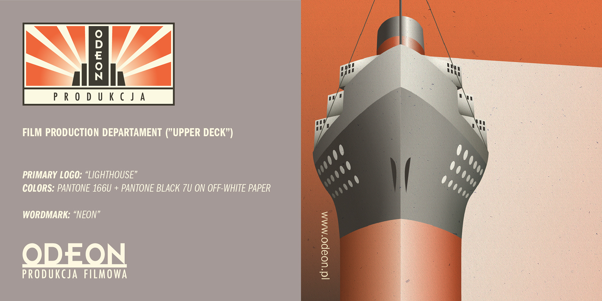
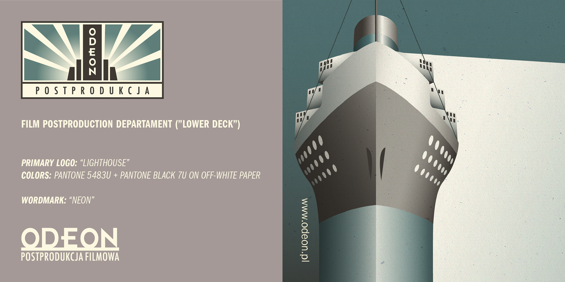
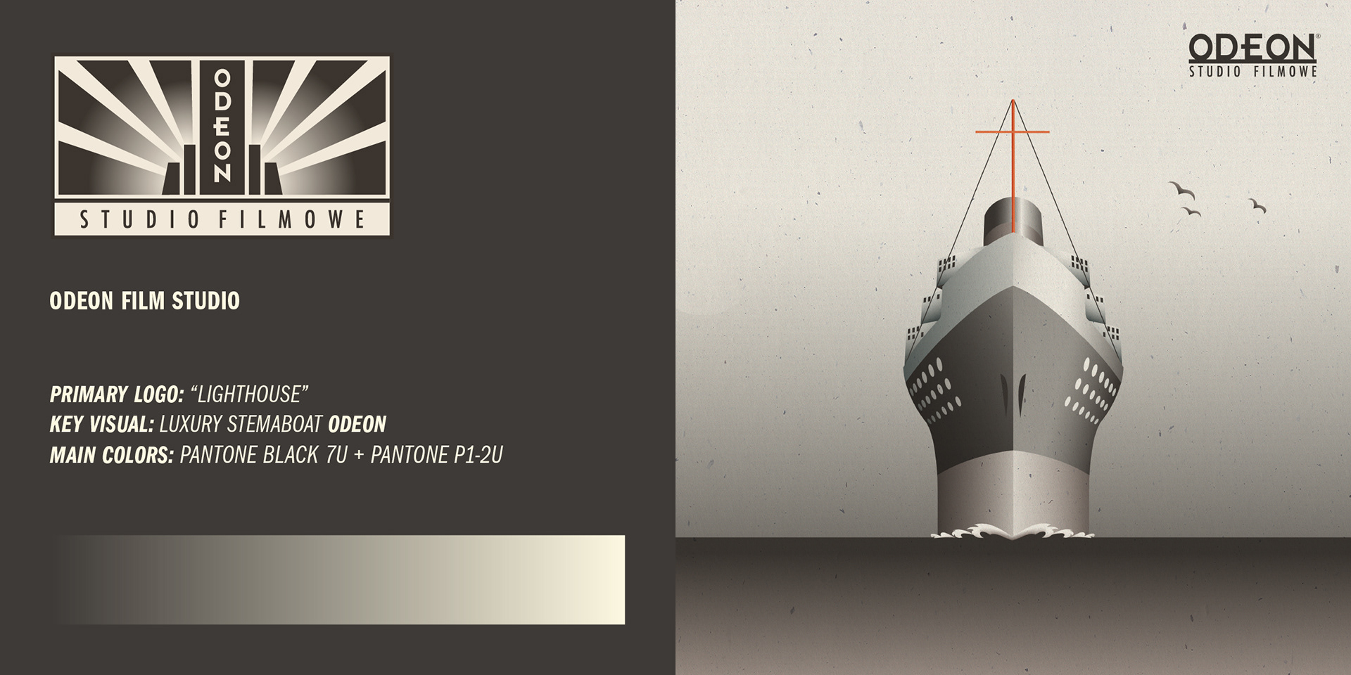
Logo and Symbolism
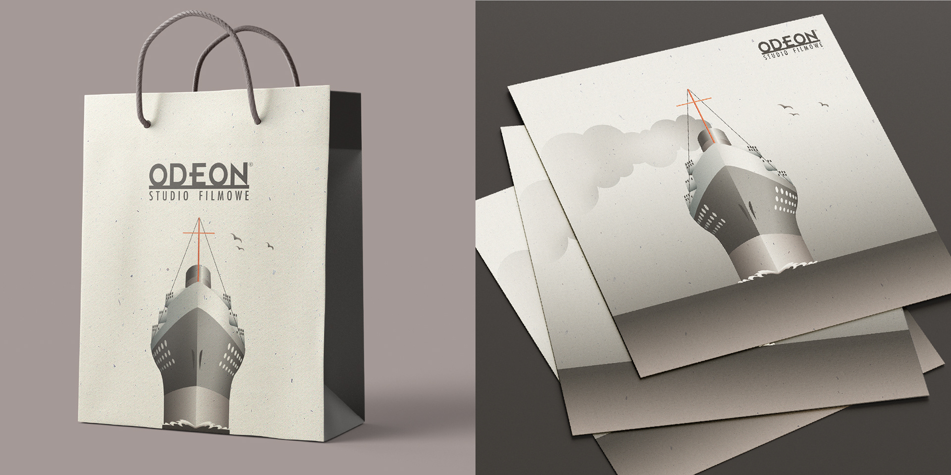
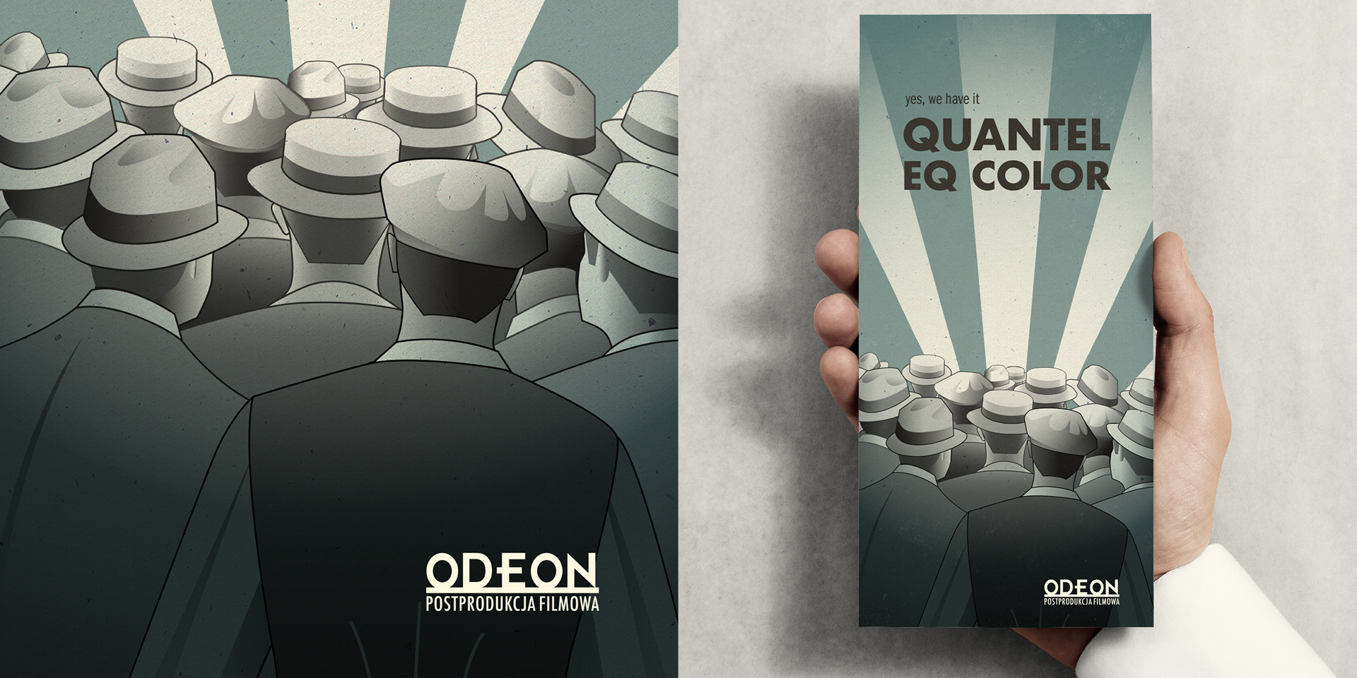
The logo evolved from a tower with a vertical neon sign into a symbol merging a lighthouse with a 1930s Odeon cinema—representing a beacon of storytelling and nodding to film’s golden age and theatrical roots.
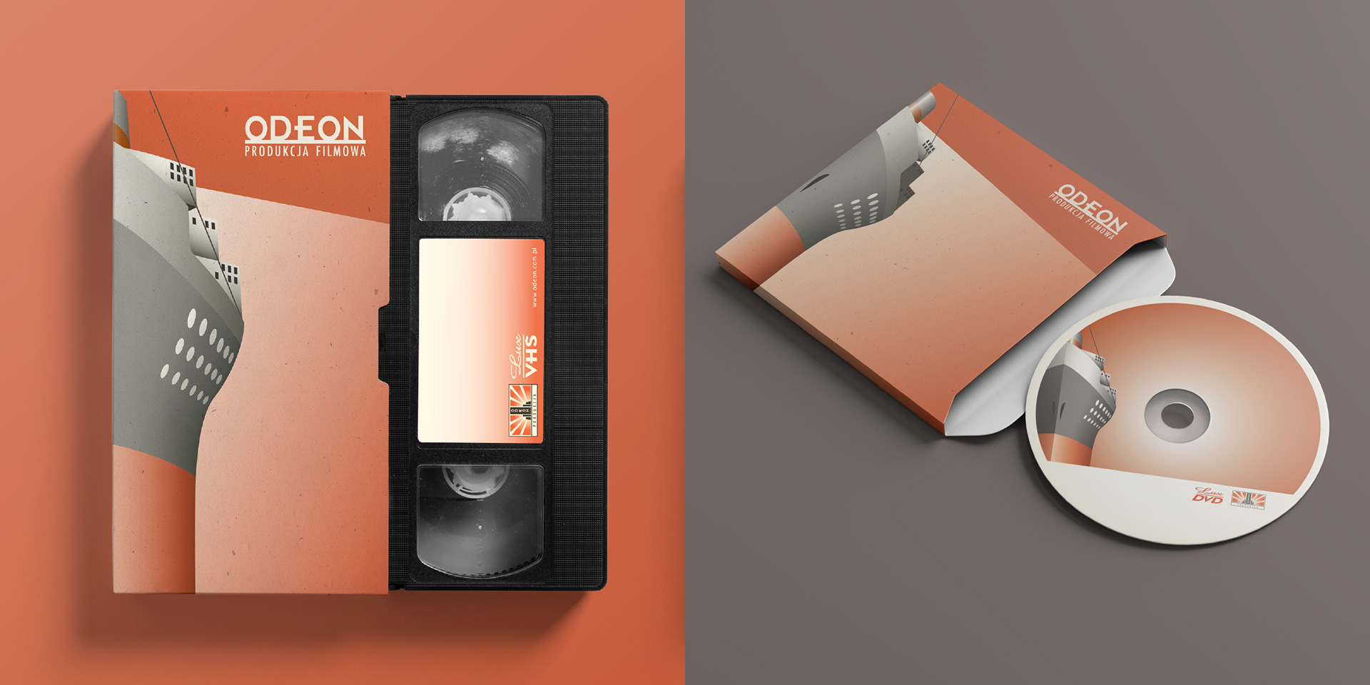
Inspired by A. M. Cassandre’s Normandie posters, I reimagined the studio as a luxury steamboat with two decks: upper deck (brick red) for film production and lower (muted ocean blue) for post-production. The palette was minimal and retro: soft black on off-white with two accent colors.
Inspired by A. M. Cassandre’s Normandie posters, I reimagined the studio as a luxury steamboat with two decks: upper deck (brick red) for film production and lower (muted ocean blue) for post-production. The palette was minimal and retro: soft black on off-white with two accent colors.

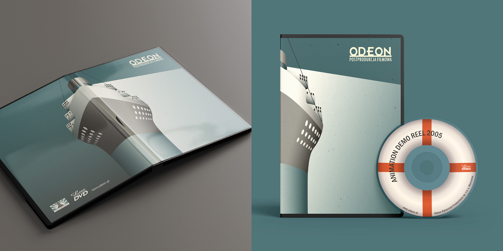
Steamship Odeon Visual System
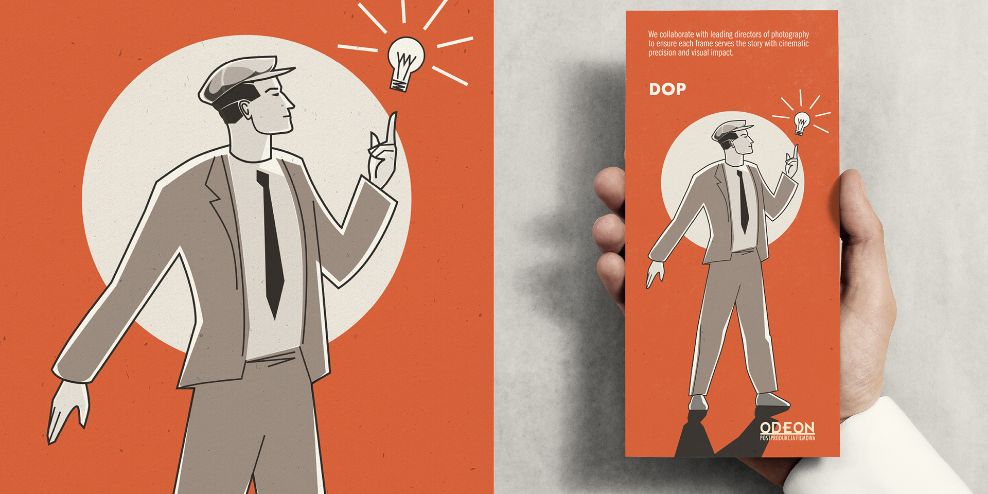
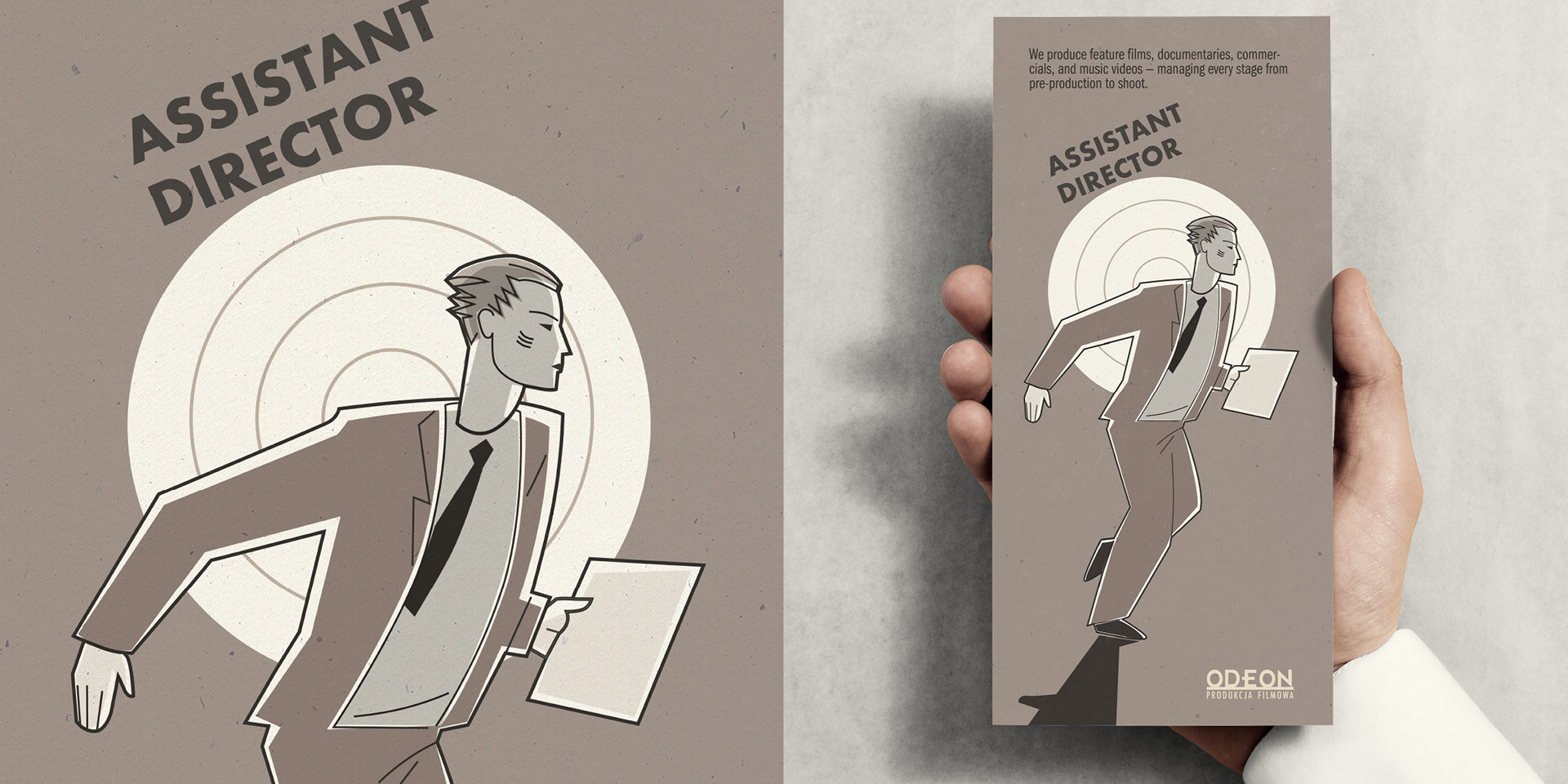
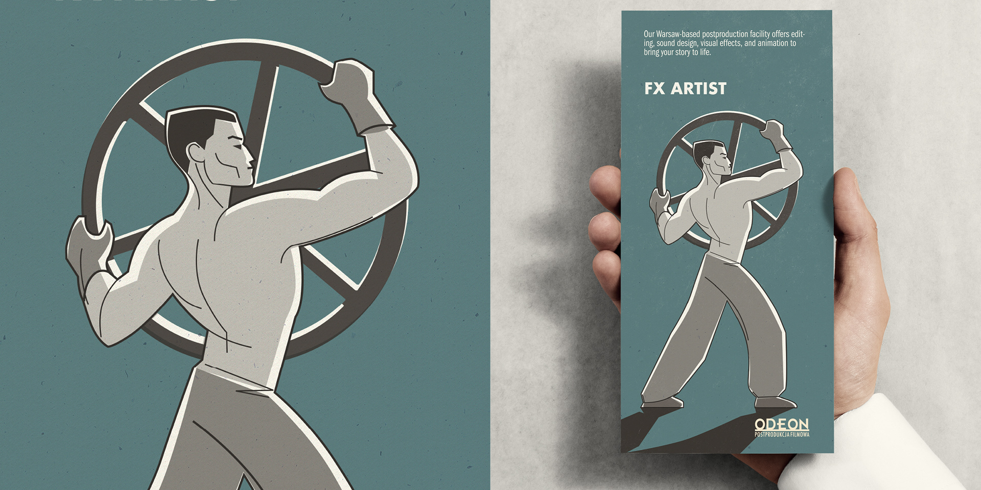
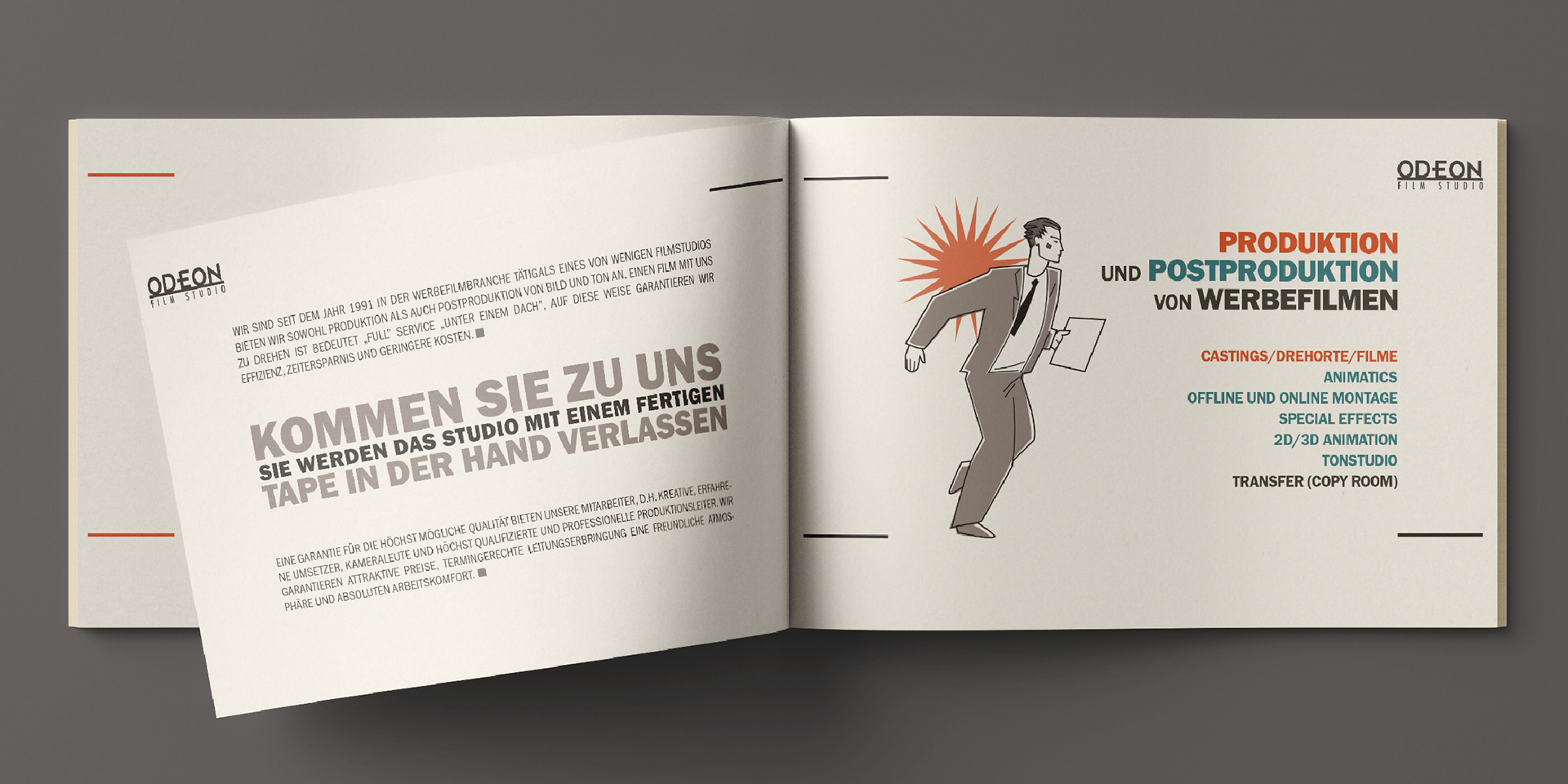
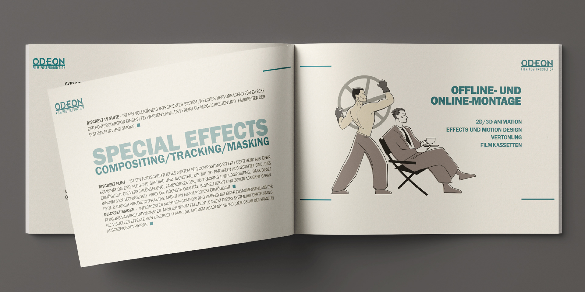
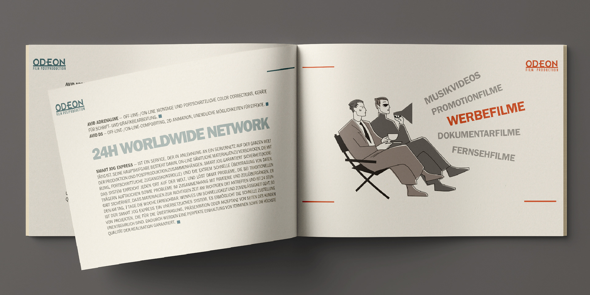
The "Steamship Odeon" (also referred to as Luxtorpedo Odeon) became a key visual for the studio’s identity. I used it across all media, packaging and print materials. To bring this imaginary world to life, I created numerous Art Deco–inspired illustrations featuring a cast of characters—from elegant producers in tailored suits on the upper deck to crew members in boiler rooms below.
This approach made the brand feel like it was inhabited by characters from an animated film—playful and cinematic.

Extended Metaphors and Packaging
The sea voyage metaphor extended to packaging, with DVDs printed to resemble lifebuoys, reinforcing the nautical theme.
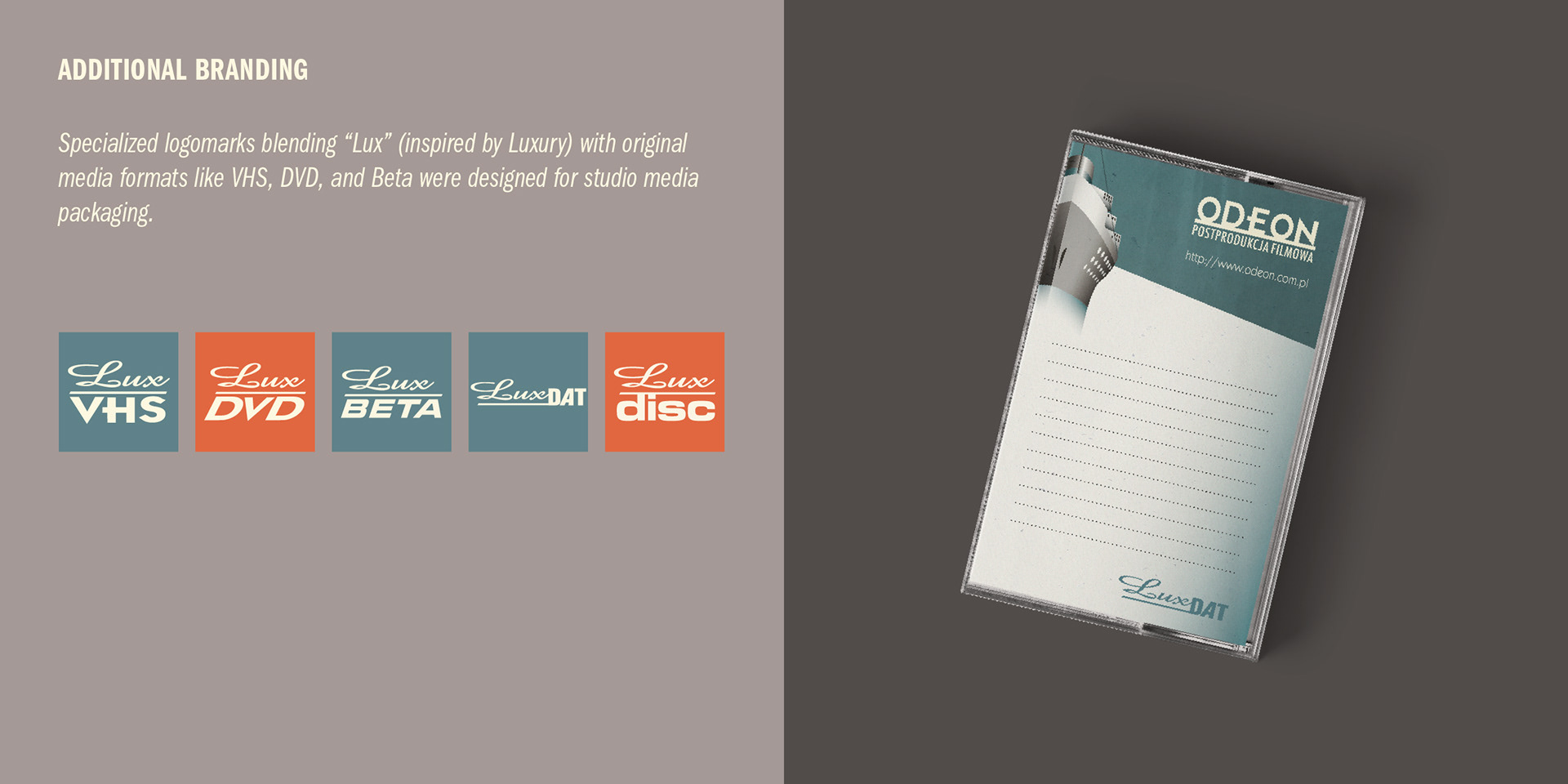
Media Format Logomarks
I designed specialized logomarks blending “Lux” (from luxury) with original media format typography for VHS, DVD, and Beta. These fresh, format-specific marks combined nostalgic references with a premium, authentic look.
Looking back after nearly two decades, this project remains a personal breakthrough—my first step into the professional world where animation met design, and storytelling took on a visual identity.
Concept, design, and presentation: Zuza Miśko
Client: Odeon Film Studio, Warszawa 2004 - 2006
______