PORTFOLIO: ATELIER MISKO
BRAND REDESIGN
BRAND REDESIGN
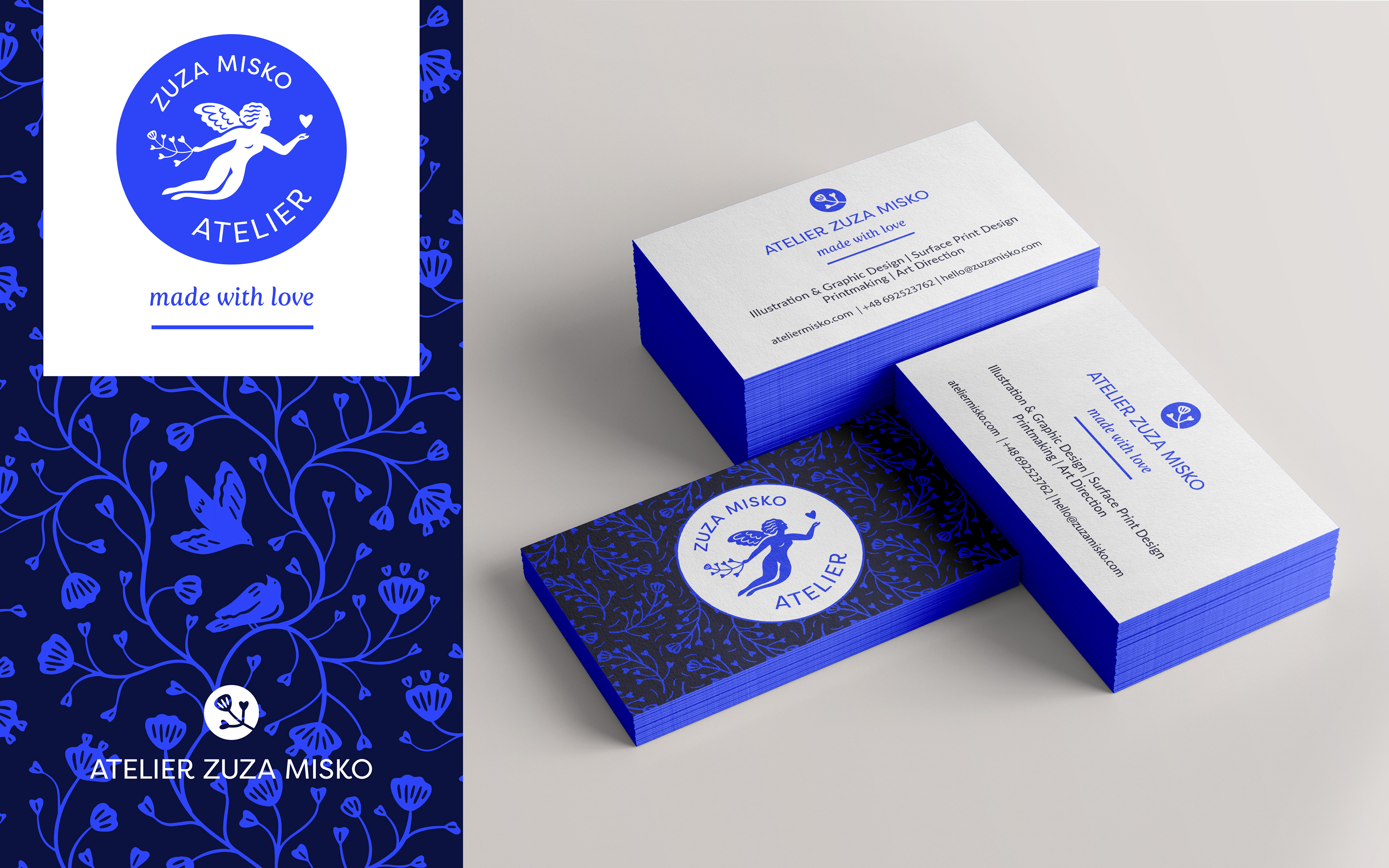
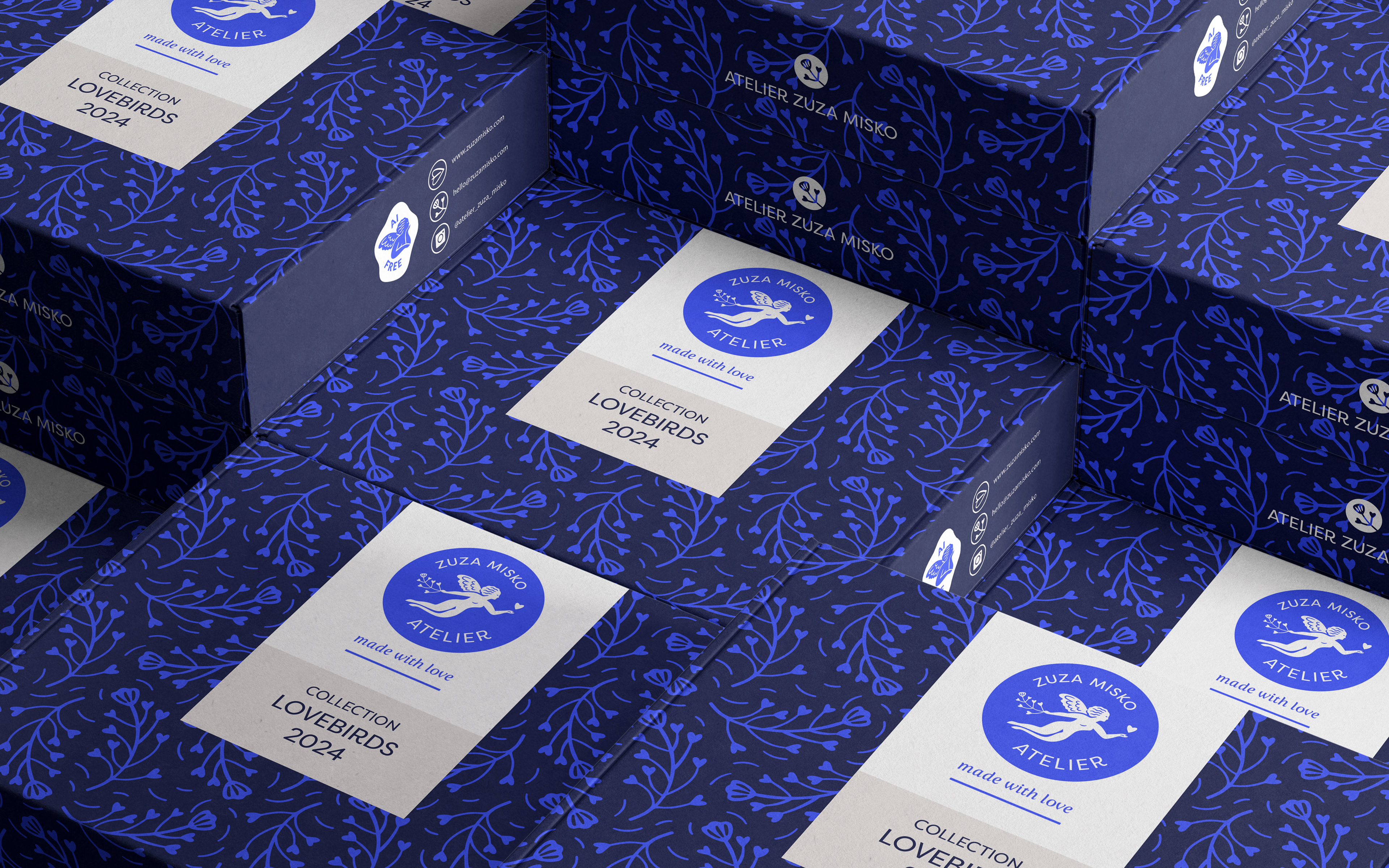
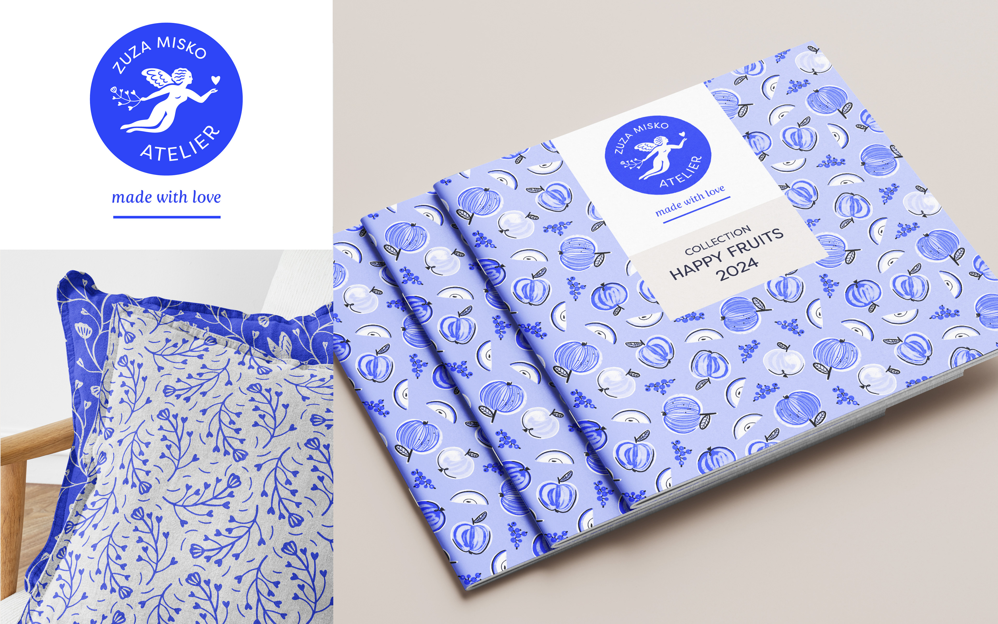
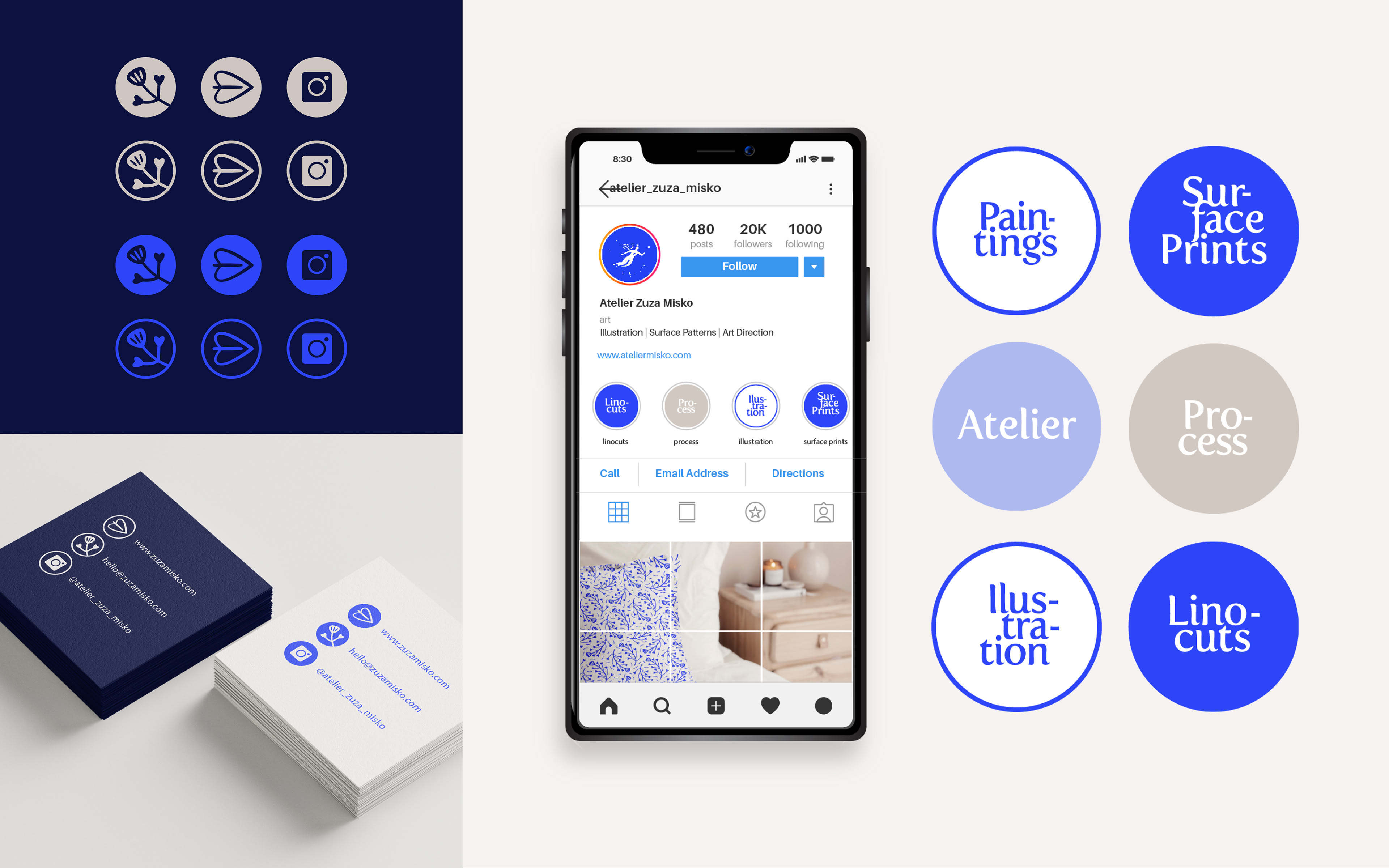
Logo and brand identity update, for opening a new chapter of Atelier Misko design practice. What initially was an illustration and a printmaking studio, gets extended with a surface pattern and graphic design service. That's why a new logo, which is a development of the old one, communicates this new strategy and is versatile, for use both online and in print in products such as packaging and catalogs.
DESIGN
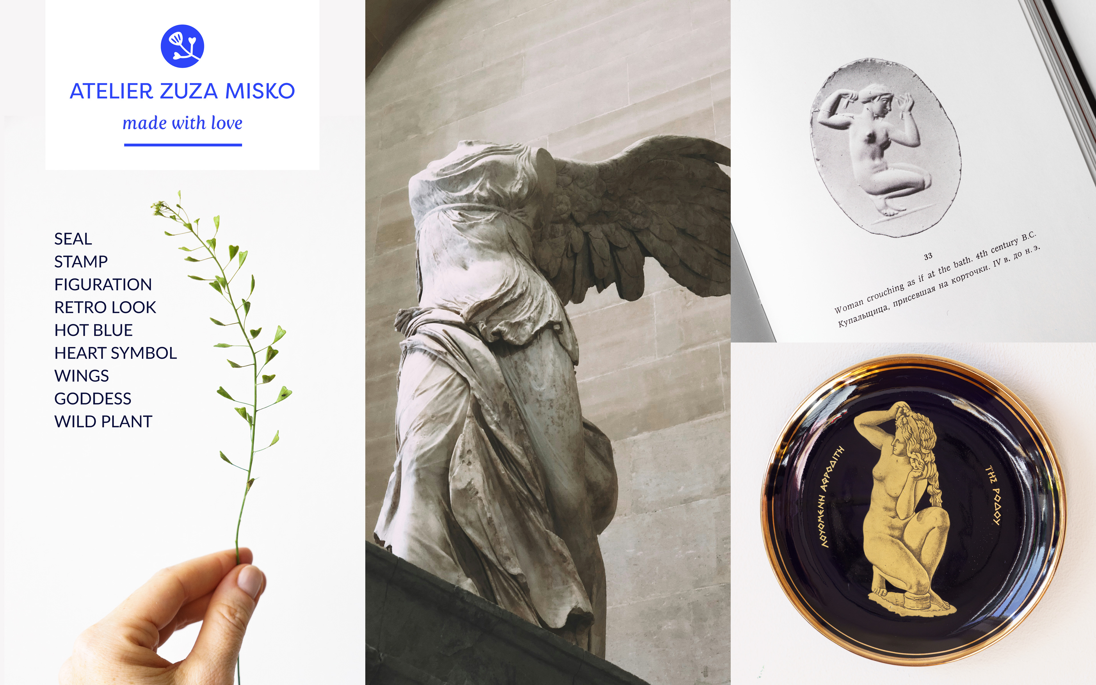
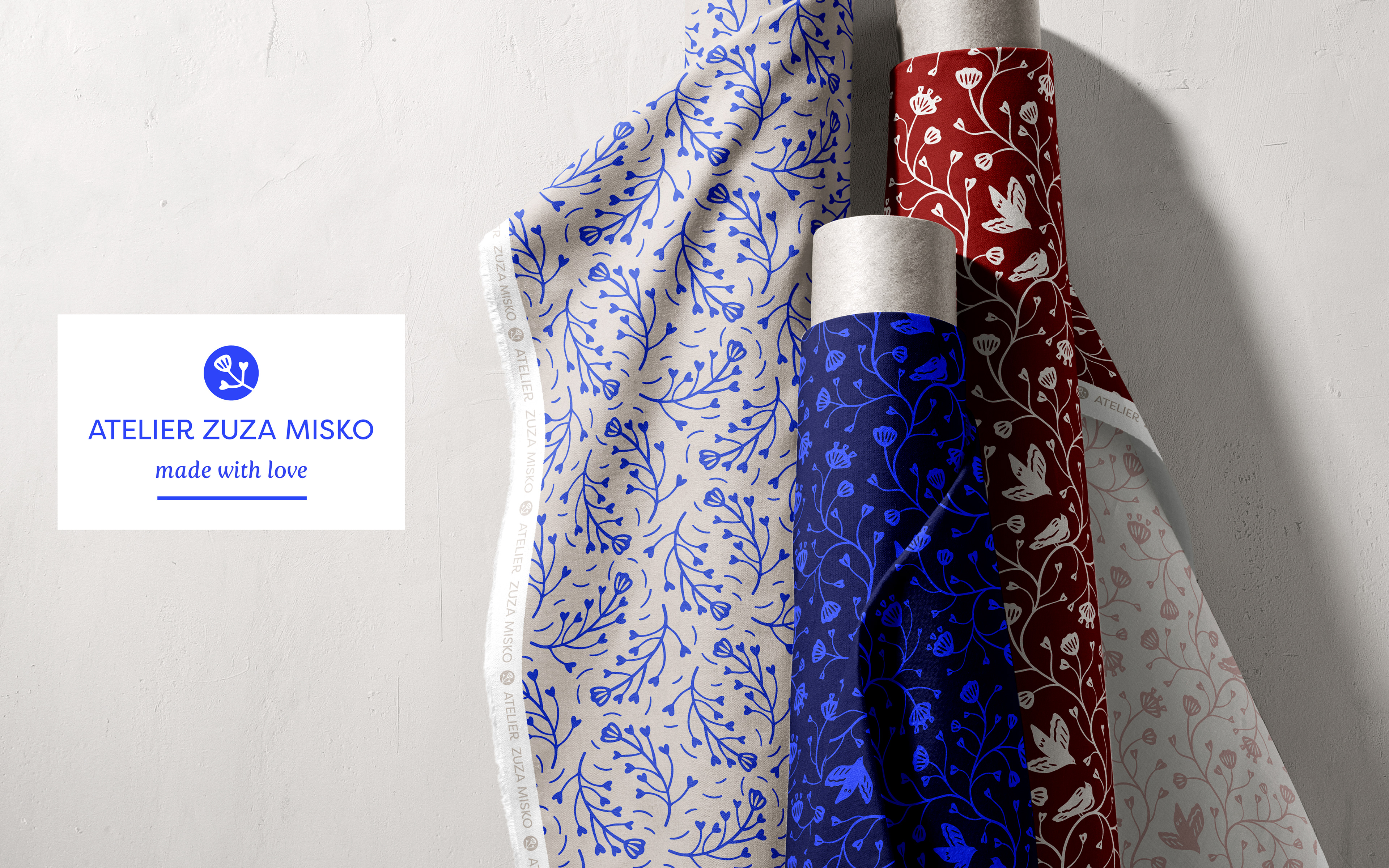
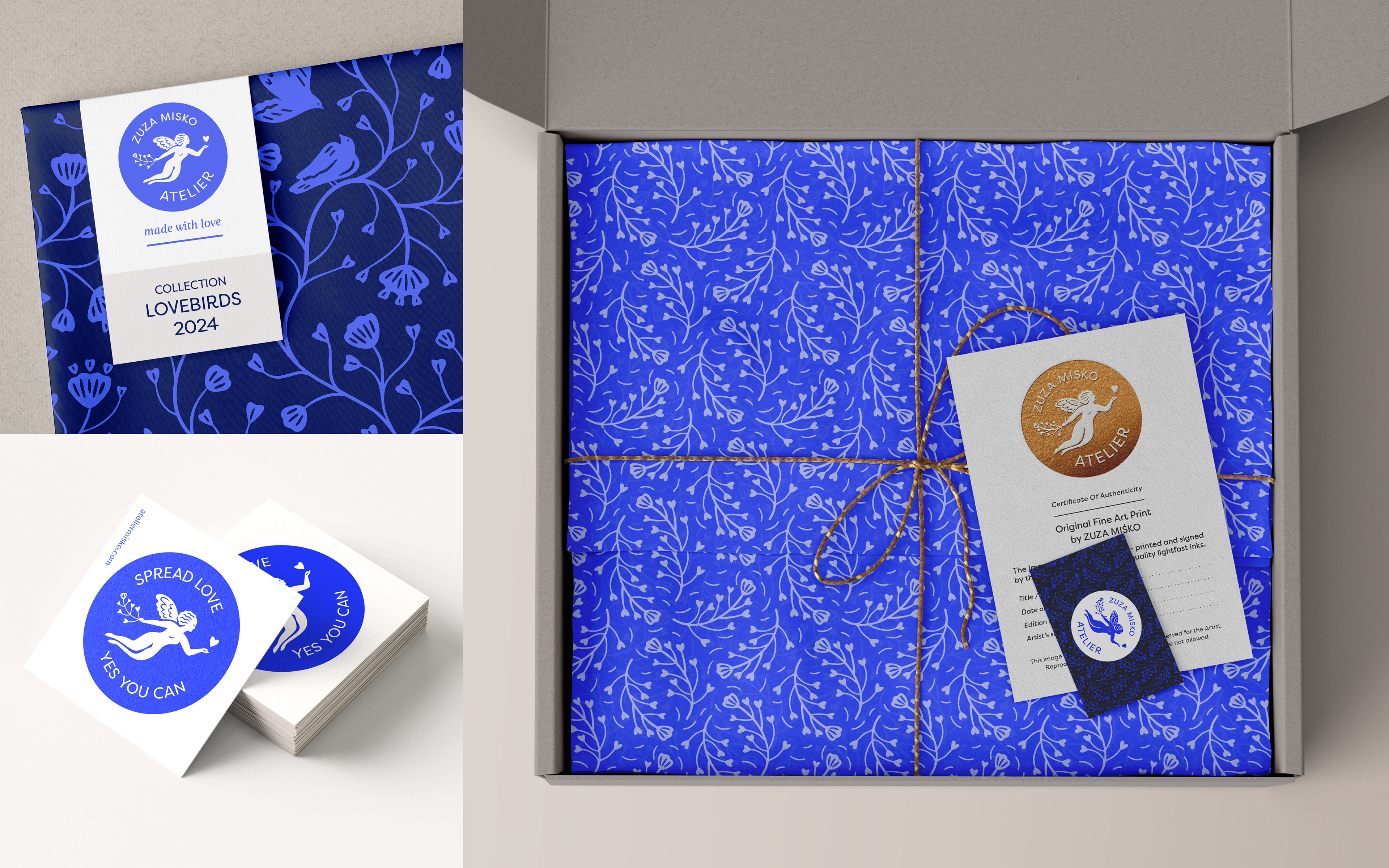
Female figures, flying characters, and plants are a recurring subject in my art. With a winged female figure as a starting point, I initially carved the illustration in lino. The printmaking style and the round stamp shape continue my tradition of using stamps, which started around 2006 when I got a Japanese personal seal 'hanko'.
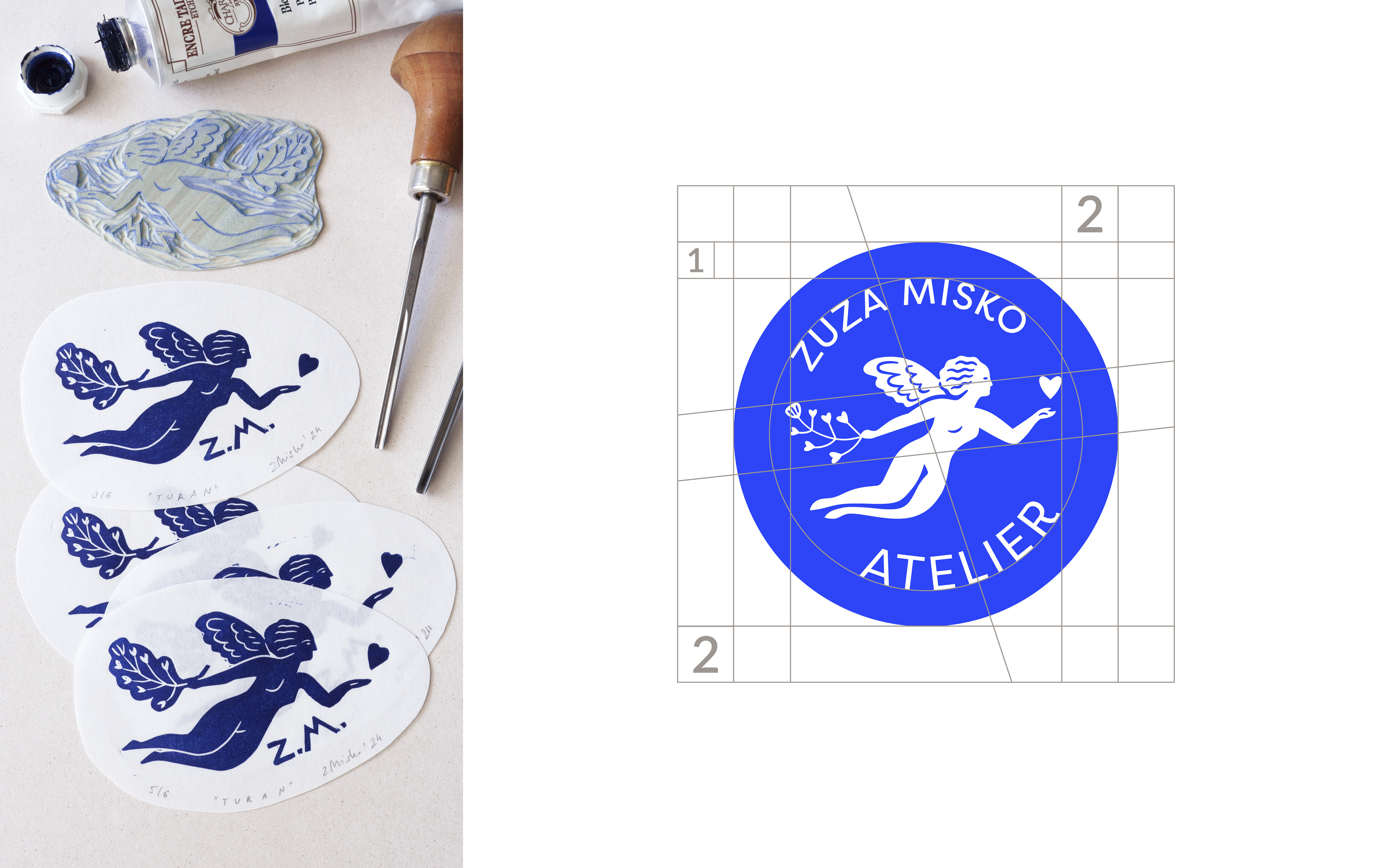
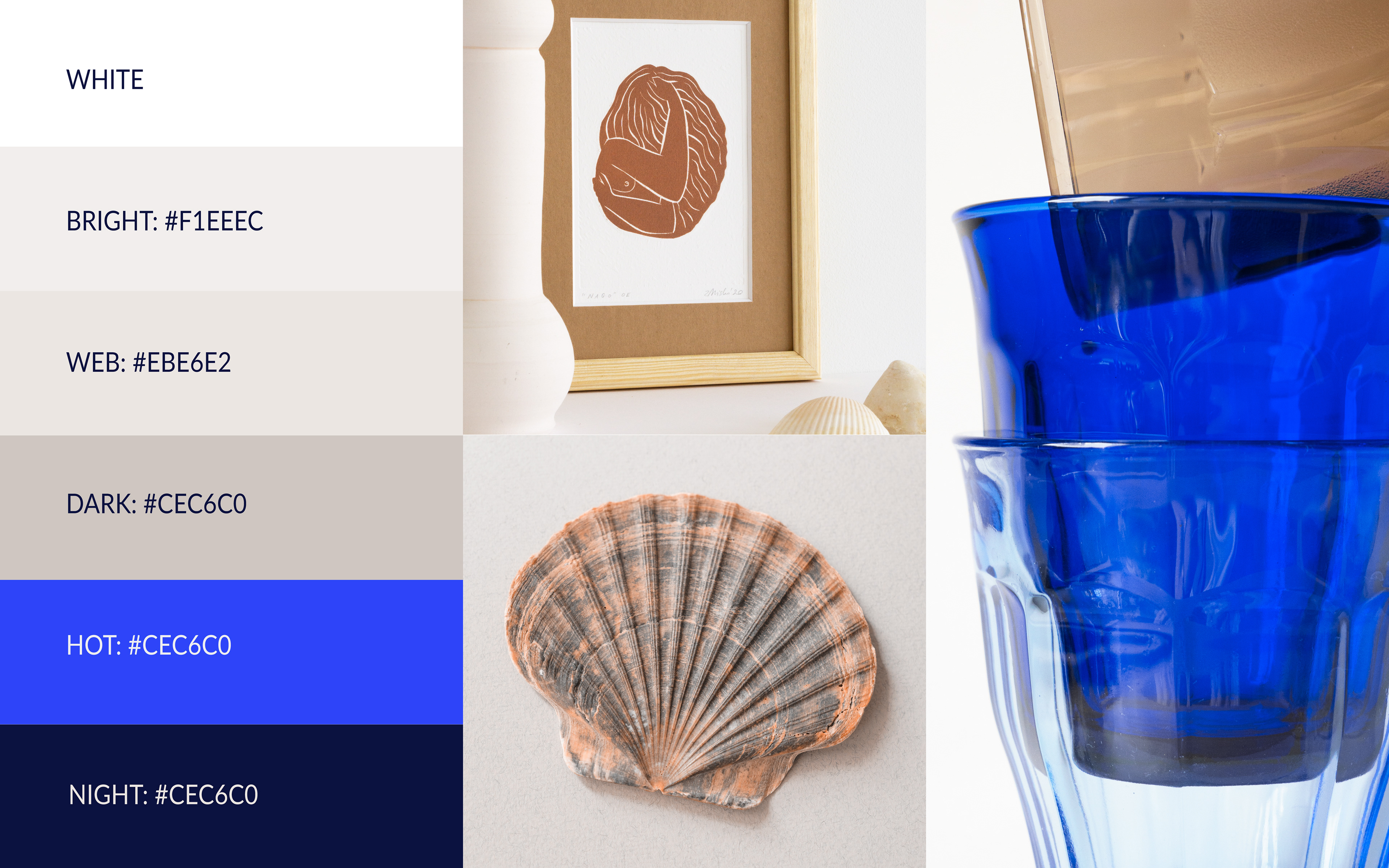
The warm and neutral palette is complemented with hot ultramarine blue, which draws attention without being too bold and works well both on screens and in print.
ANIMATION
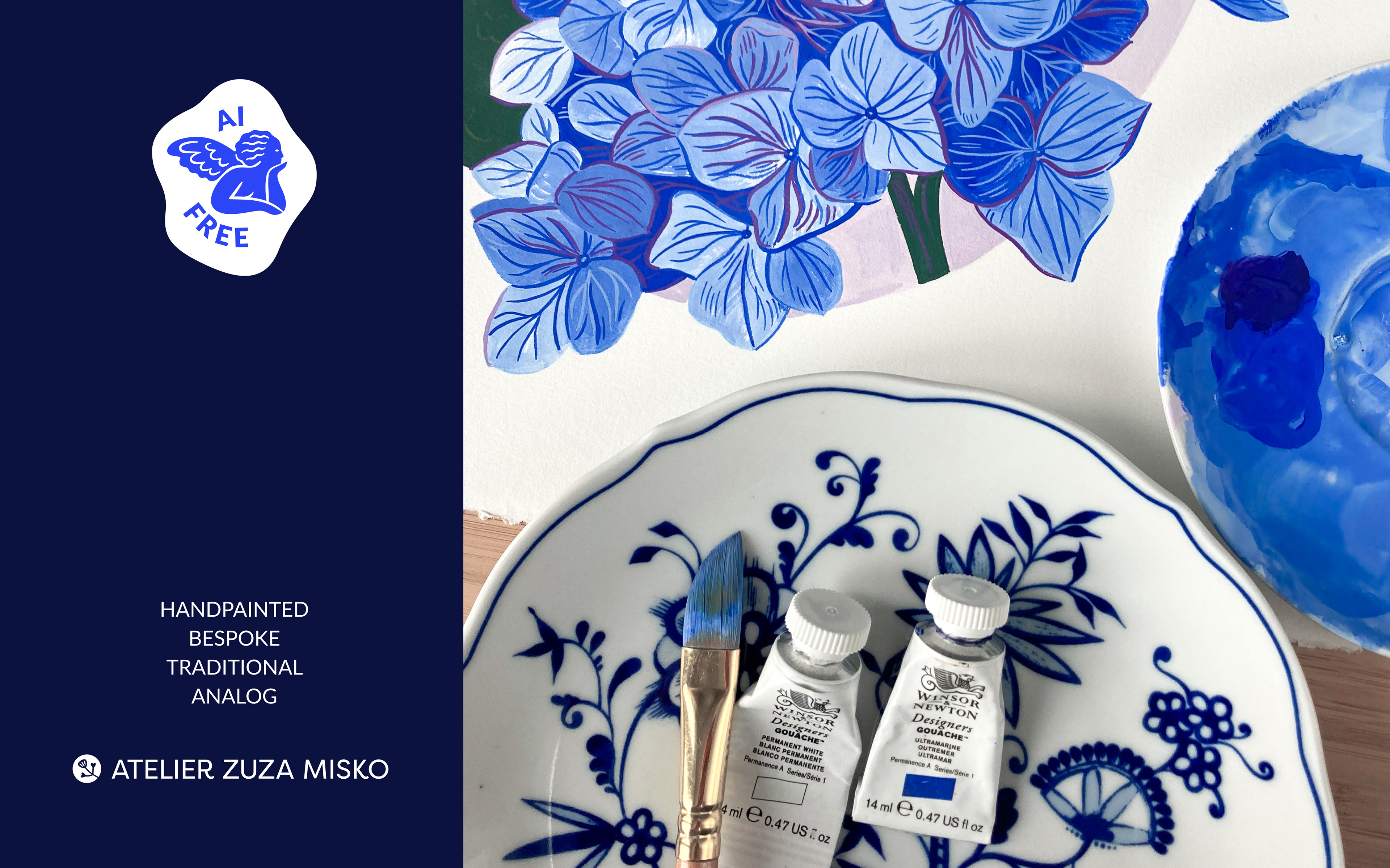
A little animation and AI FREE sticker explains the brand philosophy
______